What are the color trends for 2022?

What are the color trends for 2022?

What are the color trends for 2022?

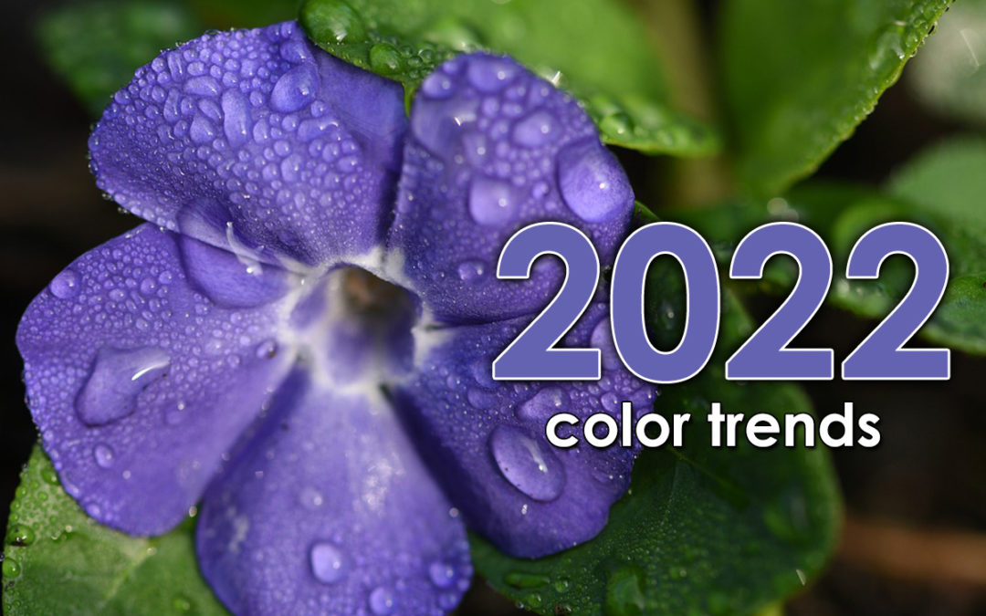
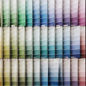
Color trends 2022: Fresh new year – fresh color palette

Purple flower image and color trends 2022

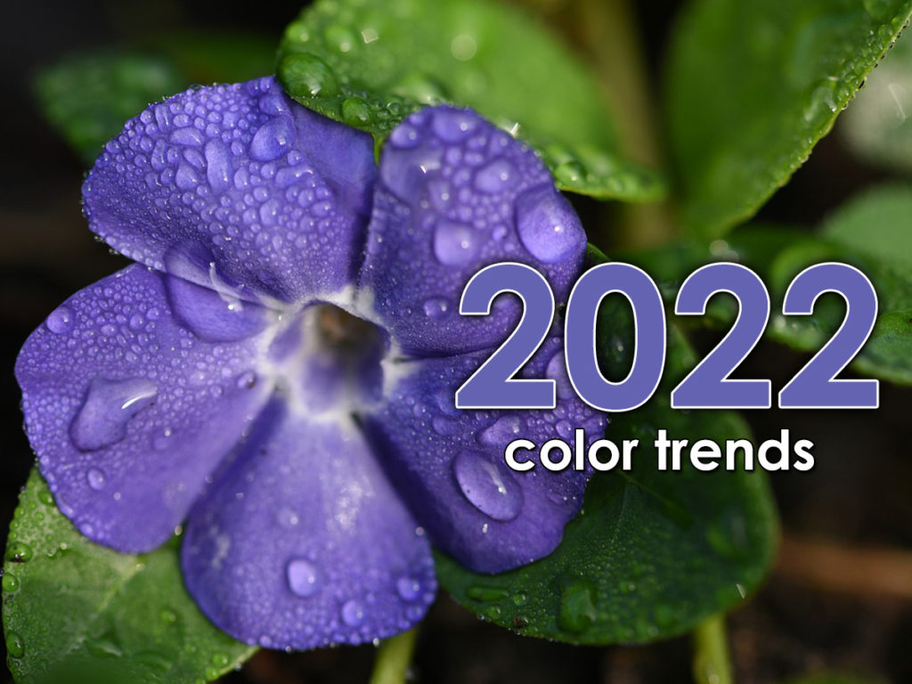
For over 20 years, Pantone has been at the forefront of color trends and has determined a ‘Color of the Year’ based on design trends, socio-economic conditions and our global culture. This year, for the first time, a new color was created to reflect the challenging, changing times we are all going through. Drum roll, please…

Introducing Very Peri!

pantone color of the year - very peri
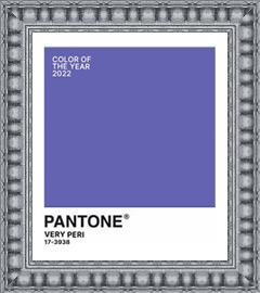
How do you describe Very Peri? It’s a dynamic blue with violet-red undertones. Pantone describes it as blending the faithfulness and constancy of blue with the energy and excitement of red.

While Pantone concentrates on an all-encompassing color trend, paint companies who determine ‘Colors of the Year’ use the same criteria geared towards home interiors.

Playing on last years ‘calm me down and help me feel secure’ color trends, it’s unanimous! Green is the home décor color of 2022! Green is a calming color and represents regrowth. With that in mind, let’s look at colors the major paint companies say will be everywhere next year.

Swatch samples for color trends 2022

Breezeway by Behr
Like a breath of fresh air, Breezeway is a cool, peaceful color tone that provides a feeling of renewal and healing.

Swatch samples for color trends 2022

Evergreen Fog by Sherwin-Williams
Combine green and gray with a hint of blue and you get a versatile and calming hue. It’s simple and sophisticated. 

Swatch samples for color trends 2022

Guacamole by Glidden
Just like our favorite appetizer, Guacamole is relaxing and refreshing. It brings an organic energy to any space.

Swatch samples for color trends 2022

October Mist by Benjamin Moore
October Mist is a muted shade of sage green that can carry a look without drawing too much attention to itself. 

Swatch samples for color trends 2022

Olive Sprig by PPG
This is a crisp, earthy color that mimics nature’s resiliency and can blend into any environment.

Using this year’s color trends in design: What will your room be wearing this year?

Very Peri could be an overall color if you are bold enough, but it will probably work best as an accent color. As part of this year’s color trends, muted greens can work as understated wall colors or accents.

living room with purple accent colors
frame with purple accent colors
living room with green accent colors
frame with green accent colors

What color trends palette do you pair well with?

Swatch samples for color trends 2022

You’re a down-to-earth, calm person who enjoys a relaxing vibe. This color trends palette combines Behr’s Breezeway with Rainy Afternoon, Snowbound, and Ultra Pure White. Pair it with warm silvers and light woods for a modern, cozy space. 

Swatch samples for color trends 2022

You’re an earthy, natural person and you like anything organic. This is a perfect color trends palette for you. Sherwin Williams pairs Evergreen Fog with Neutral Ground, Dried Edamame, and Ethereal White. Top it off with light colored woods such as Maple.

Additional color trends topics:

Try this trick

When you are visiting Disneyland or Disney World, have you noticed the trashcans or fences? No? That’s because they are painted Go Away Green. This proprietary paint color is actually several different shades depending on the area and what they are trying to conceal. Want to hide unsightly items in your yard? Try these paint shades:

Swatch samples for color trends 2022

Color and art consultations

Do you want advice on how to use different color trends in your home? It can be overwhelming to put a color scheme together. We can help! Our design experts will help you pick out colors that match your space and style. We offer in-home color, art and design consultations and we would love to help you at your convenience. Call us for an appointment.

swatch samples on rack

Framing problems and how to fix them

Framing problems and how to fix them

Framing problems and how to fix them

What’s wrong here?

what's wrong here?

Do you ever wonder why some framed art is easy to look at, and some makes you want to move past it quickly? It could be the art itself – maybe you don’t care for the style or subject matter, like abstracts or landscapes – but maybe it’s because of the way it’s framed. Yes, the framing design makes a huge difference and there are some simple ways to avoid framing problems with your cherished pieces.

We’ve framed four pieces of art (each with two mats and one frame) in two different ways so you can see how the framing impacts the visual presentation. Let’s take a look at how you can solve some common framing problems.

Framing problems: Serenity in the guest room

This serene, peaceful image is perfect for your guest room, which has green accents and oak furniture. The top mat should be green to match, right? And the frame should match the furniture? Not necessarily. These are some common framing problems that people encounter when worrying about how to make the frame match the decor instead of complement the art.

Neutral colors sourced from the photograph (and not your walls) will let the art shine, as well as blend with your current décor. By matting it just a shade darker than the light on the water, we avoid competition with the focal point. The frame continues the soft, neutral vibe, making it easier and more peaceful to get lost in the serene view.

sunset photo in wood frame with mat, solving framing problems
sunset photo in light frame with mat, solving framing problems

Framing problems corrected for photographs

Family photograph

There is no better reason for a family portrait than an addition to the family! Wouldn’t it be cute to use the baby’s outfit for the mat colors and a brown frame to match those darling curls? Maybe, maybe not. What kind of framing problems can be corrected for these kinds of photos?

If it’s the baby you really want to see and not the frame design, make your eye go right to the focal point. This can be done by letting the bold color of the outfit stand out on its own instead of competing with the framing. In this case, a soft white doesn’t interfere with the blue outfit, taking your eye straight to the baby and the parents’ delighted faces.

Pink flamingos

You could watch flamingos all day long  so you found a beautiful photo that lets you do just that. Of course, you want the flamingos to be what you see first when you look at it, so the best thing to do is neutralize it with a white mat, right? And the pink frame is a play on the flamingo color! Great idea….or is it? Bright colored images can pose all kinds of framing problems.

In this situation, the white mat contrasts with the pink, so pink is what you see – not the flamingo, just the frame. The white mat is stark – it creates a strong outline around a fairly dark image. Instead, pull the colors from the background, leaving the focal colors alone. Are the flamingos easier to look at now?

flamingo photo in coral frame with mats
flamingo photo in gilded frame with mat
family photo in rounded frame with mat
family photo in thin frame with mat

Framing problems corrected for abstract art

Abstract art is versatile and can frequently go with any décor because the design is usually non-specific. Abstracts can create a soothing feeling or add a splash of color to a space. Because abstract art sometimes has a lot going on, it’s best to give it space, or it can look confusing. This is the most common framing problem with abstract art but is easily solved to let your art shine through.

This colorful example was designed with the same two mats and frame, but with different matting proportions. The first appears cramped and overwhelmed, forcing your eye to the framing instead of the art. The second is easier on the eyes, with ‘breathing room’ for the art. Which would you rather look at?

swirl painting in frame with mat, solve common framing problems
swirl painting in frame, solve common framing problems

wall panel with float frames
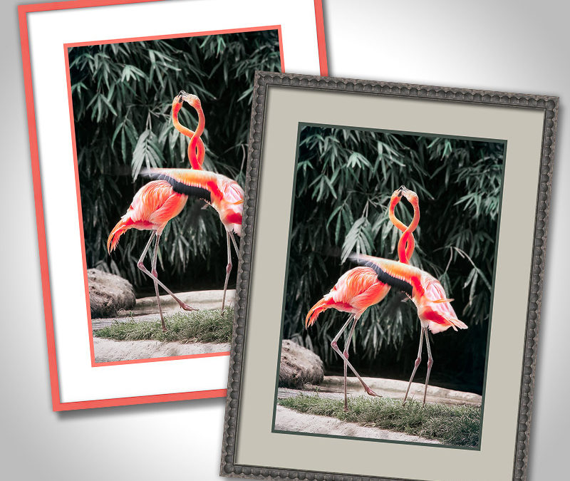
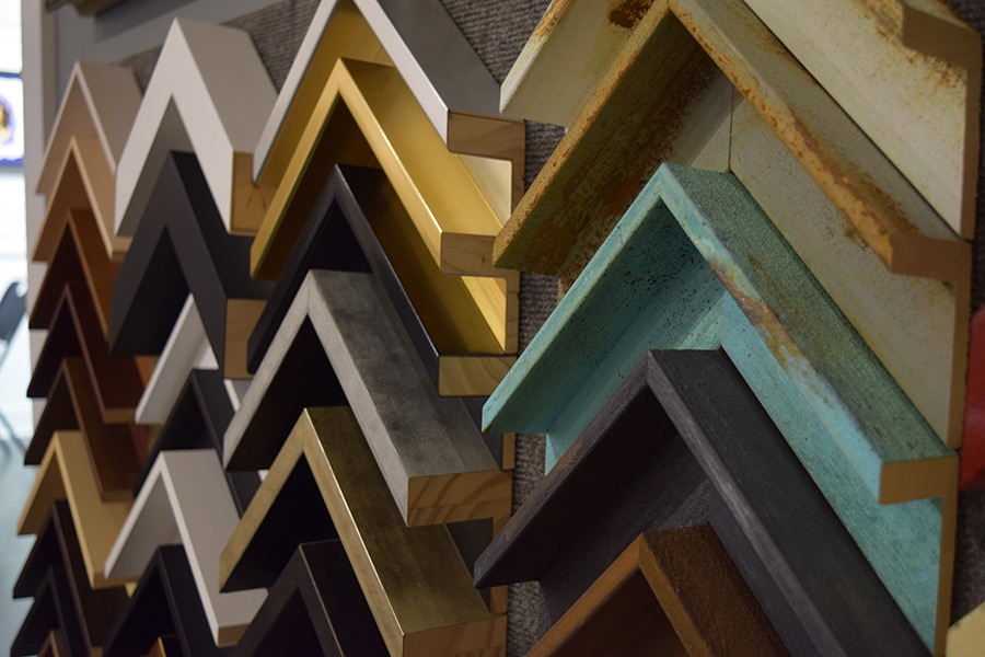
Other framing problems and quick tips


How to solve framing problems with the design

  • Stick to colors that are in the art
  • The mat color should not be lighter or darker than any color in the art
  • Contrast the top mat with the focal point
  • Vary the widths of the design package components


Design preview

See it framed before you buy it! We know how painful it can be to make a decision from a corner sample. But not anymore! We can show you what that corner sample will look like all around your art before you say yes. Stop in to see your design preview and let us solve any framing problems beforehand.

The ABCs of framing

The ABCs of framing

The ABCs of framing

The ABCs of framingThe More You Know…

When you are at a frame shop, do you hear terms you aren’t familiar with? Does it sometimes feel like a foreign language? We’ll take you back to school – grab a pen & paper and let’s begin on the ABCs of Framing!


child looking at alphabet print on wall

A is for ART – The reason and foundation for framing

B is for BALANCE – Various art and framing components working together

C is for CONSERVATION – Making sure no materials are used to harm your art

D is for DESIGN – It must be pleasing to the eye!

E is for ELATED! – How you feel when you receive your completed project

F is for FRAME – It holds it all together

G is for GLAZING – Glass or acrylic protection from dust, bugs and harmful UV light

H is for HANGING – What else are you going to do with that piece?

I is for INSPIRED DESIGN – What our designers can do for you

J is for JOINING – Attaching the cut moulding together to become a frame

K is for KEEPSAKE – A special memento fit for framing

L is for LIGHTING – You want to see the art, so illuminate it!

M is for MAT – To keep the glazing off your art

blank chalkboard in frame, DIY with chalkboard paint

N is for NON-GLARE – Glazing that has a reduced reflection for enhanced visibility

O is for OPEN! – We are open Monday-Friday 9-6 and Saturday 9-4:30

P is for PICK-UP – We’ll come to you. And we deliver, too

Q is for QUALITY – It’s what we build. We want your project to last forever

R is for RELATIONSHIP – Nothing is more important to us than building one with you

S is for SHADOWBOX – A deep frame for 3D objects

T is for TAPE – Special framer’s tape holds fine art in place without damage

U is for ULTRAVIOLET – Rays that can harm art. Use UV-filtering glazing for protection

V is for VIRTUAL – We can do this online

W is for WOOD – What most frames are made from

X is for X-BAR – A cross-bar creating extra strength for textiles or oversize projects

Y is for YELLOWING – Discoloration that can happen when acidic materials touch your art

Z is for Z-BAR – Used to hang heavy or large pieces

Now you know the ABCs of Framing!

How many terms did you know?

Most of them are familiar, but if you knew all 26 – you must be a framer!

If you knew 15, you’ve had several pieces framed OR you listen to us when we talk.

If you knew 5, we need to see you more often – Stop in today!

blank chalkboard in frame, DIY with chalkboard paint

Dress Up Your Chalkboard

A chalkboard: The old school way of communicating. Still a great way to capture notes. Here is an elegantly framed chalkboard worthy of the classroom’s attention. Dress up your chalkboard with a custom frame!

Custom frame your travel memories

Custom frame your travel memories

Custom frame your travel memories

Frame your travelsRemember your vacation every day!

Travel, souvenirs and memories – they go together like a hand in a glove. Some of the best travel memories are triggered by the souvenirs you bring back from vacation. They tell a story. By preserving those souvenirs with custom framing, you can have those travel memories forever. What’s your favorite travel story?

Travel memories & stories

Yellowstone Poster - frame your travels

National park poster from Yellowstone

Vacationing in America’s first National Park was on your bucket list, and you finally made it! You couldn’t believe how much wildlife there was to see up close and personal, or how impressive Old Faithful truly was. Now you have the framed poster to remember the great time you had.

Egyptian papyrus - frame your travels

Papyrus grass art from Egypt

The papyrus plant is a tall, leafless aquatic plant that can grow up to 16 feet high and is native to Egypt. The white pith inside is used to make the paper, which is used to paint on. It is an old-world craft, from an old country. But the paper is brittle and needs protection, so you were wise about getting it framed.

Print of florence, Italy - frame your travels

Etching from Italy

While strolling the avenues of Florence, you found a street artist who was selling etchings of the very view you were looking at – the Piazza Del Duomo. How could you resist? Now it hangs in your office to give you a mini vacation from work.

African wedding necklace - frame your travels

Wedding necklace from Africa

It was hard to choose from the many necklace styles that were handmade by the village women, but you liked this one the best. What a great conversation piece you created by having it framed.

Postcards from Hawaii - frame your travels

Postcards from Hawaii

You know postcards are meant to be sent in the mail, but these images were frame-worthy! You made a great choice choosing a frame that looks native to the islands.


Photo of hawaiian sunset - frame your travels

Sunset photo of the Islands

Hawaiian sunsets never disappoint, and it’s hard to take a bad photo of such rich colors. Neutral framing lets the bold view stand out.

Redecorating your home office

Home office with frames

This last year you’ve most likely spent more time in your home than you thought you ever would. You may have even rearranged some things around to create a home office or noticed that your home office needed a redo. A little paint, a new rug and fresh art – that will work! Vacation photos and travel memories make the perfect addition to help take your mind off work occasionally.

Tip: If you are working with an interior designer, talk to them about incorporating your travel memories and souvenirs into a design plan.


See some of our other blogs for additional tips and resources:

It’s all in the details with quality framing

What’s your style identity?

Framing newspapers, articles, and other printed media

Are the walls closing in? A new framing project can help.

Bringing art home from vacation

While on vacation, you fell in love with a painting that had already been framed. The question is… do you ship it home that way? How much do you love the frame? Will the dealer or artist reduce the price if you don’t want the frame? How much would it cost to ship it home framed?

If you decide to bring the painted canvas back unframed, ask the dealer or artist to remove it from the frame – DO NOT cut it off the frame! Take the staples out of the stretcher frame. Cover the painting with glassine and roll it up (not tightly) and put into a tube – plastic is best. That is the least expensive way, and then you can have it framed exactly the way you want it.

If it is a piece of art on paper, and fairly small, cover both sides with glassine, and secure between two pieces of hardy cardboard. If it is small enough, you should be able to transport it in your luggage. If not, shipping it should not be expensive. Once it is safely home, remove it from the cardboard and take it to your framer so your travel memories can be properly preserved.

Frames from around the world

Chateau frames from France
Dillon frames from Montana
Komodo frames from China

Color is a fun way to set the mood

Color is a fun way to set the mood

Color is a fun way to set the mood

colorful and fun
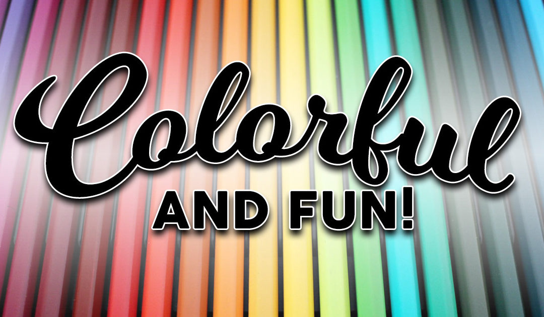
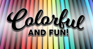
Use color to bring out a range of fun feelings!

Not all art is serious! Some art is just fun, and color is a big part of that. Have you noticed how color can greatly influence the vibe in a room or the tone of art? Do you know how to choose art and décor that can create a certain feeling? Let’s break it down and look at how color influences almost everything around us.

How do you want your space to feel? Playful? Energetic? Bold?

Color can create the mood you want.

Andre Derain painting, the power of color

Reds and Oranges

Reds and Oranges are energetic colors. They are used to stimulate the body and mind, promote power, and increase appetite. That’s why many dining rooms and gyms have one or more red or orange walls.

Painting by André Derain, L’Estaque, 1906

Claude Monet Water Lilies painting, the power of color

Yellows

It is believed that the color Yellow stimulates the nerves and purifies the body, lifting your spirits and reducing stress. Is it any wonder many kitchens are painted yellow?

Painting by Claude Monet, Water Lilies, 1919

Georgia O'Keefe painting, Blue Green Music, the power of color

Blues & Greens

Blues & Greens are restful, stable colors with a stress management quality. They create a soothing feeling, encouraging calmness. Does it make you think of spas or medical offices?

Painting by Georgia O’Keefe, Blue & Green Music, 1921

orange flower in blue frame, the power of color

Energetic

In this image there is an energetic orange flower. Adding its complementary color blue brings out the best in each.

flower painting in colorful frame, the power of color

Playful and relaxing

It’s fun to watch the yellow and orange flowers sway in the breeze, but the calming blue color in the background makes this image relaxing.

Las Vegas poster in black and red frame, the power of color

Bold and passionate

The red inner frame emphasizes the passion of this fun Las Vegas print.

ADDITIONAL TOPICS

#1 – White mat or black mat? Which color will work best for your project?

  • White is the great neutralizer. Sometimes there can be so many colors and so much action in the art, that it is hard to choose one color – this is where white works well.
  • Black creates negative space so all you see is the art or image.
  • White is a contemporary / fresh, clean / uncluttered look.
  • Black is a sophisticated and elegant look.
  • White works well when you want to group a look (multiple pieces framed the same).
orange and white frame
orange and black frame

#2 – Colorful mouldings

Sometimes it’s fun to use a colorful moulding in your framing project. Stop by our showroom to see the many colors we carry in a wide variety of frames, both modern and traditional.

the power of color with frames

#3 – According to color-related studies

  • Warm-colored (yellows, oranges) placebo pills are more effective than cool-colored (blues, greens) placebo pills.
  • Blue-colored streetlights can lead to reduced crime.
  • Red causes people to react with greater speed and force, something that might prove useful during athletic activities.
  • Black sports uniforms are more likely to receive penalties.
  • Paint your office blue and green: In 1999, researchers at Creighton University found that employees in blue offices felt the most centered, calm, and hopeful towards their work. Since blue can lower heart rates and green can reduce anxiety and is associated with money, a combination of blue and green is best for the office.

It’s all in the details with quality framing

It’s all in the details with quality framing

It’s all in the details with quality framing

Take a closer look at details in quality framing vs bad framing

A question we often hear is, “Why is custom framing expensive?” The quick and easy answer is that it is ‘custom’ – it is being handmade specifically for your design and your needs. More importantly, it is because of the impeccable quality of workmanship we put into every project and our dedication to quality framing. Details matter in custom framing. Here are a few that deserve a closer look and how they can impact quality framing.

mat board issues with quality framing

Example #1: Matboard issues

  • Notice the over-cut mat corners? This happens when the blade cutting the mat extends further than it should, something that shouldn’t happen in quality framing.
  • The darkened beveled edges are due to the acid in the mat– this can ‘burn’ into your art and damage it. Ask for ‘acid-free’ mats to avoid this.
frame edge issues and quality framing

Example #2: Frame issues

  • Notice the ragged edges on the corner of the frame? This happens when the blade on the saw that is cutting the moulding isn’t sharp enough, tearing at the wood instead of slicing through it.
  • Some frame corners have large gaps due to uneven cuts or warped moulding. We like to keep our corners clean and even!
quality framing and fitting issues, mat warped in frame

Example #3: Fitting issues

  • Notice the warped mats? This happens when the mat is cut too large for the frame – squeezing it in the package. It also can happen if moisture creeps into the frame package. Again, something that doesn’t happen with quality frmaing.
  • Turn it over — is there backing paper? This will help keep moisture and dust out, but also bugs that can eat your art.

Example #4: Glass issues

  • Notice the faded art? This happens because the glass used to protect the art isn’t UV-filtering, meaning it offers no protection from UV rays. Insist on quality framing UV-filtering glass for your next project.
  • Is glare blocking your view of the art? Ask for options that minimize or eliminate glare.

With quality framing, it’s all in the details

All of these issues can easily be avoided.
All it takes is a little more time, attention to detail, and quality materials. Our professional framers have years of experience. You won’t see these problems with our quality framing because we care about your art.

Workmanship Guarantee We offer a workmanship guarantee. Ask us for details.

satisfaction guarantee logo

Conservation / Preservation Grade Materials Because we want your art or heirlooms to survive for a lifetime without change of color, damage from glues, or out-gassing from materials that are not acid-free, we use the very best materials for your projects.

Quality & Design Quality framing is not as noticeable at first as design, but it’s just as important! We use acid-free and 100% cotton rag mats and UV-filtering glass. Many of our frames are hand-finished solid wood. The design is usually what everyone notices first, and our designers work with you to develop the best design for your piece.