Framing pop quiz!
How much do you really know about framing design?
Taking a piece of art to a framer can seem overwhelming and complex. You may not know the right questions to ask or what to look for when the designer shows you choices. Here’s a quiz to help sort it all out. Remember that beauty is in the eye of the beholder — what matters most is what looks good to YOU!
Question #1
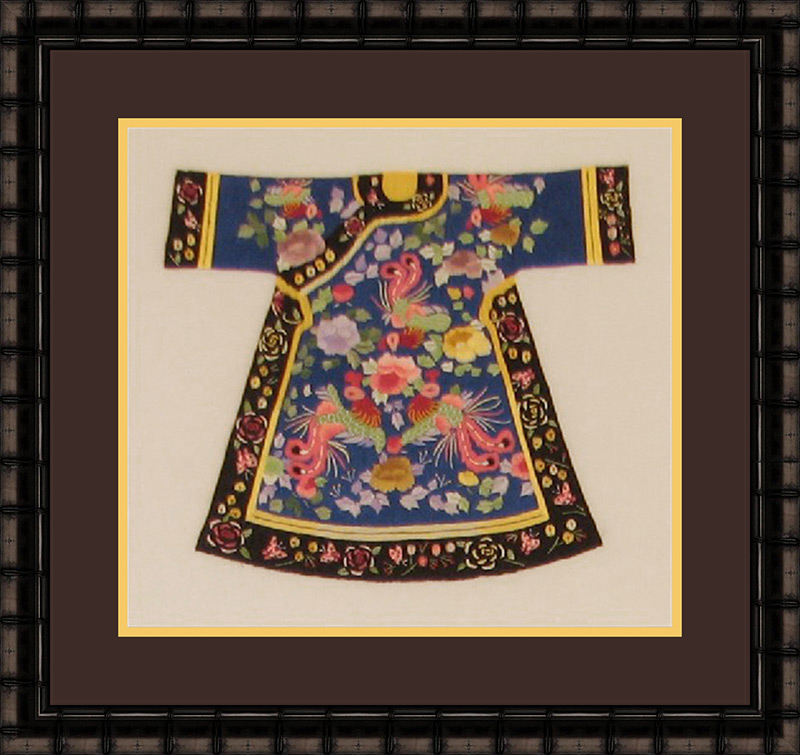
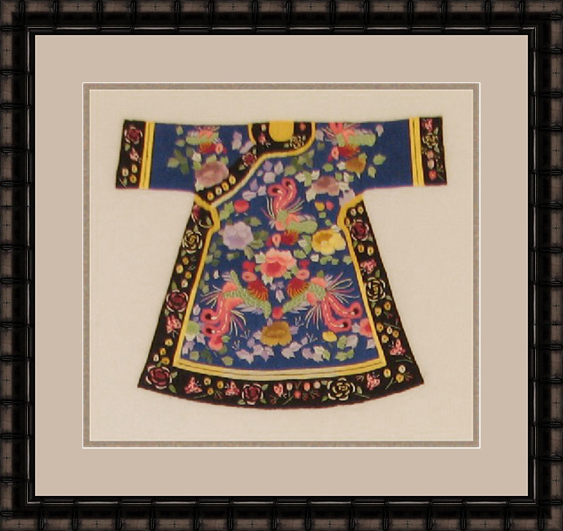
In which design is it easier to study the kimono?

ANSWER:
Ideally, when you view art, you want to ‘get lost’ in it. Sometimes an overpowering colored mat can take away from being able to do just that.
In the first example, there is so little of the blue color in the art that it does not make sense to allow it to dominate. It is best to use it as a complimentary accent (second or bottom mat).
In the second example, the brown top mat creates such a strong contrast to the light background that it pulls your eye away from the kimono. The light-colored mat becomes the focal point and the kimono secondary.
In the third example the two-tone neutral mats all but disappear and encase the kimono. The mat colors don’t compete with any color in the art, so your eye goes straight to the kimono. That harmony makes you want to study the kimono further.
Tip: Sometime the more colors and busier a piece of art is, the more ‘neutralized’ it needs to be.
Question #2
Match the color examples to its design style: Versatile, dramatic, or decorative?


ANSWER:
There is no right or wrong answer when it comes to design; it all depends on what style you are going for.
The black mat surrounding the art is the most DRAMATIC because it features high contrast colors — white on black — and creates a feeling of elegance and sophistication.
The maroon coloring example is DECORATIVE; using such a bold color is usually done as a statement, to match accessories, or to be on-trend. Be careful, that ‘match’ may change in a couple of years.
The neutral example is the most VERSATILE due to its neutral tones allowing both focus and color contrast.
Question #3
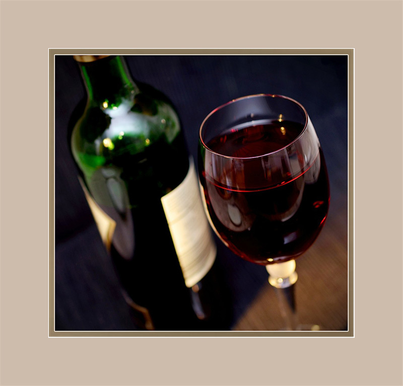
Which mat color do you think works best & why?
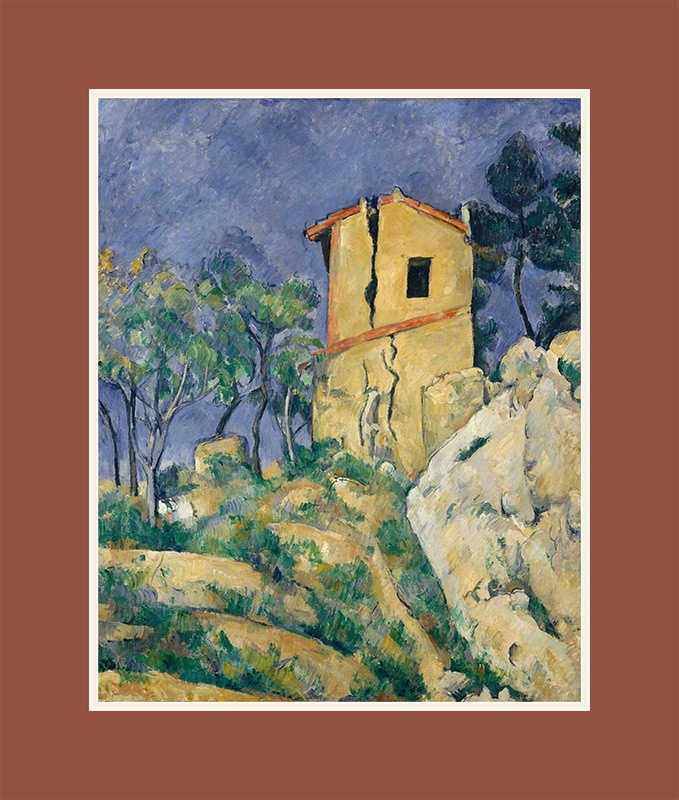

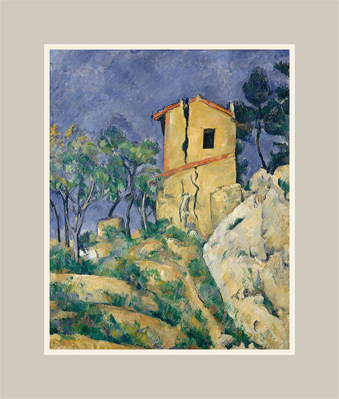
ANSWER:
In this painting by Paul Cezanne, the tower is the focal point. In framing design, the focal point is what you notice first upon viewing; we always want to emphasize the focal point with as little competition as possible. Your mat colors should help draw the eye to the art, not the matting.
In the first example, the top mat is the same color as the focal point. These colors compete, and your eye doesn’t know where to focus.
The second example uses the same color blue as in the art to extend the background, but because there is a lot of background already, it is not necessarily needed. (Extending the background is useful when the focal point takes the majority of the area.) Blue and yellow are complementary colors, so this particular coloring would be an excellent choice.
The third example uses a neutral color found in the art, which may be what works best with your décor … but because the yellow focal point and tan mat are so close in color, the mat washes out the focal point.
There is no wrong answer to this design question. It’s a matter of what you want to see, and what works best for you.
Question #4
ANSWER:
All of the above!
A white mat is a wonderful thing. White mats can ‘neutralize’ busy, colorful art. They give a clean, modern look to a piece of art or photograph. White goes with everything, so white mats can create a cohesive look to multiple pieces of art.
Tip: Make sure that the white mat is not brighter than any white in your art, or it will be a distraction.
Question #5
What is the purpose of matting?

A. Mats serve as ‘visual padding’ between your frame and artwork.
B. Mats keep the glass from touching your artwork.
C. Acid-Free mats are part of an archival-safe environment for your artwork.
D. All of the above.
ANSWER:
All of the above!
Matting serves many useful functions and adds to the appearance and preservation of your artwork. Matting enhances your art by creating visual ‘breathing room’ between your art and frame, as well as emphasizing color.
Tip: If you want the very best, choose acid-free ‘Rag’ mats – they are 100% cotton.
Additional Topics:
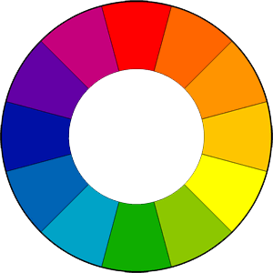
Color Harmony
Three basic color schemes and how they work for your art
Monochromatic

A Monochromatic color scheme uses shades & tones of one color. Variations of lightness and saturation create a stylish, sophisticated palette that is simple and easy to look at. The most basic would be black and white art (including shades of grey).
Complementary
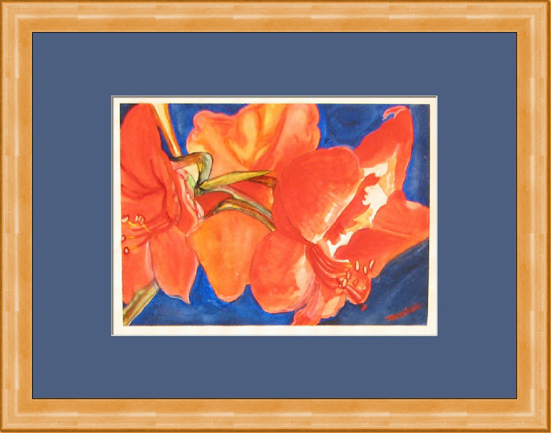
A Complementary color scheme uses two colors that are located directly across from each other on the color wheel. Examples include Blues & Oranges, Yellows & Purples, and Reds & Greens. The high contrast of complementary colors creates a vibrant look, bringing eye-catching energy to art.
Analogous

An Analogous color scheme uses colors that are next to each other on the color wheel. These colors are naturally harmonious together. This creates a peaceful, serene feel if using blues and green, or a bold look if using yellow, orange and red.