Color is a fun way to set the mood
 Use color to bring out a range of fun feelings!
Not all art is serious! Some art is just fun, and color is a big part of that. Have you noticed how color can greatly influence the vibe in a room or the tone of art? Do you know how to choose art and décor that can create a certain feeling? Let’s break it down and look at how color influences almost everything around us.
How do you want your space to feel? Playful? Energetic? Bold?
Color can create the mood you want.
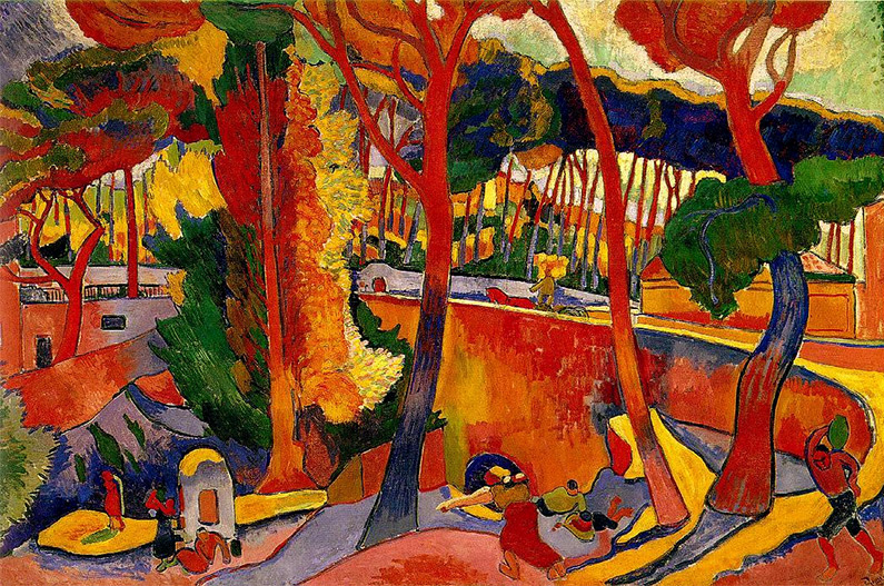
Reds and Oranges
Reds and Oranges are energetic colors. They are used to stimulate the body and mind, promote power, and increase appetite. That’s why many dining rooms and gyms have one or more red or orange walls.
Painting by André Derain, L’Estaque, 1906
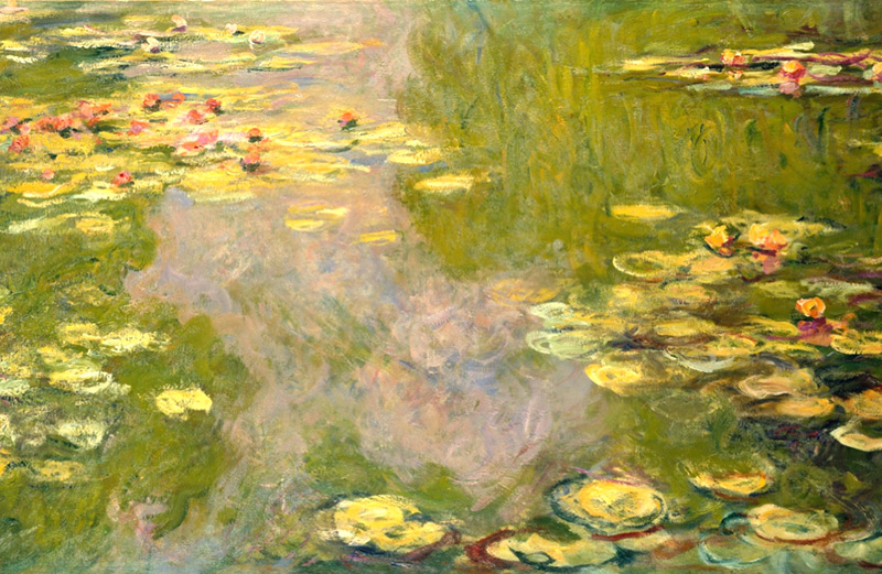
Yellows
It is believed that the color Yellow stimulates the nerves and purifies the body, lifting your spirits and reducing stress. Is it any wonder many kitchens are painted yellow?
Painting by Claude Monet, Water Lilies, 1919
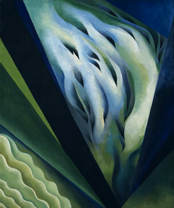
Blues & Greens
Blues & Greens are restful, stable colors with a stress management quality. They create a soothing feeling, encouraging calmness. Does it make you think of spas or medical offices?
Painting by Georgia O’Keefe, Blue & Green Music, 1921
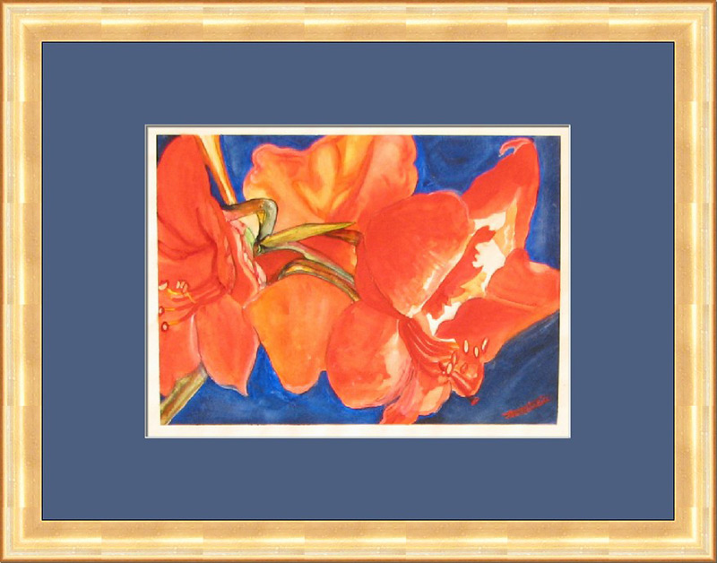
Energetic
In this image there is an energetic orange flower. Adding its complementary color blue brings out the best in each.
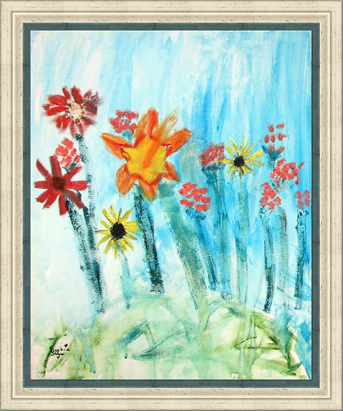
Playful and relaxing
It’s fun to watch the yellow and orange flowers sway in the breeze, but the calming blue color in the background makes this image relaxing.
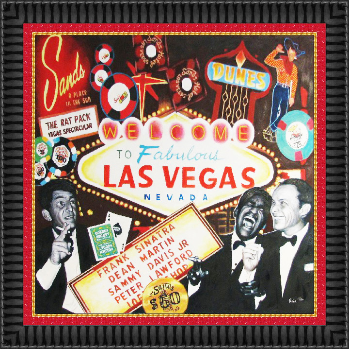
Bold and passionate
The red inner frame emphasizes the passion of this fun Las Vegas print.
ADDITIONAL TOPICS
#1 – White mat or black mat? Which color will work best for your project?
- White is the great neutralizer. Sometimes there can be so many colors and so much action in the art, that it is hard to choose one color – this is where white works well.
- Black creates negative space so all you see is the art or image.
- White is a contemporary / fresh, clean / uncluttered look.
- Black is a sophisticated and elegant look.
- White works well when you want to group a look (multiple pieces framed the same).
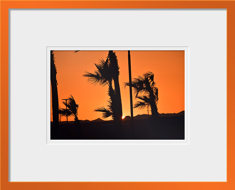
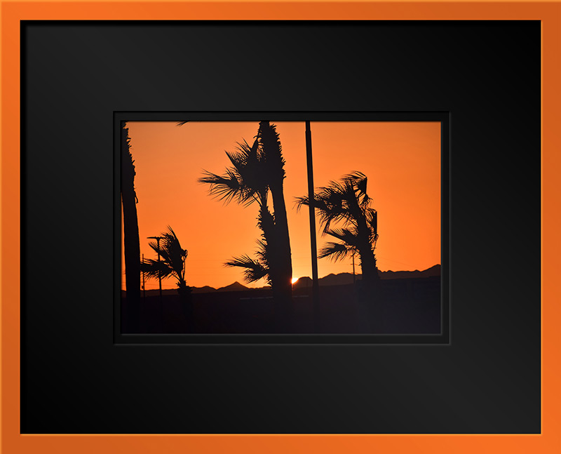
#2 – Colorful mouldings
Sometimes it’s fun to use a colorful moulding in your framing project. Stop by our showroom to see the many colors we carry in a wide variety of frames, both modern and traditional.
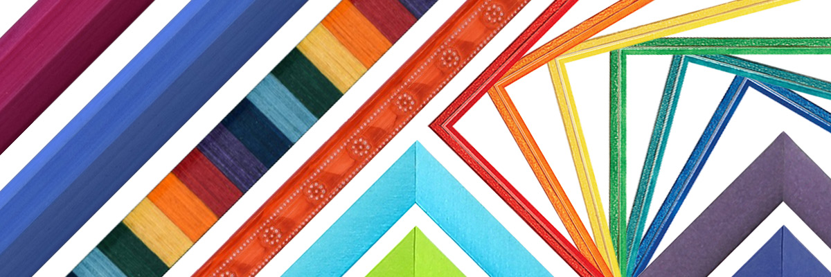
#3 – According to color-related studies
- Warm-colored (yellows, oranges) placebo pills are more effective than cool-colored (blues, greens) placebo pills.
- Blue-colored streetlights can lead to reduced crime.
- Red causes people to react with greater speed and force, something that might prove useful during athletic activities.
- Black sports uniforms are more likely to receive penalties.
- Paint your office blue and green: In 1999, researchers at Creighton University found that employees in blue offices felt the most centered, calm, and hopeful towards their work. Since blue can lower heart rates and green can reduce anxiety and is associated with money, a combination of blue and green is best for the office.
