A gallery wall, when one is not enough
Displaying framed image groupings or creating a gallery wall
Traditionally when hanging pictures on the wall, one picture would be hung by itself and that was that. While a single piece of art can be inspiring and lovely to look at, sometimes you need your wall display to do more. Does it need to tell a story? Is it a conversation piece? Does it continue to capture your attention?
When one picture is not enough, you can group images together for a more cohesive display. Framed groupings are very fashionable right now, often known as gallery walls. No longer do you have to decide which piece goes on the wall — put them all up!
It’s easy to create a grouping that is completely unique to you, your style and your home. The good news is there are no rules, and lots of different ways to achieve an interesting grouping for your gallery wall.
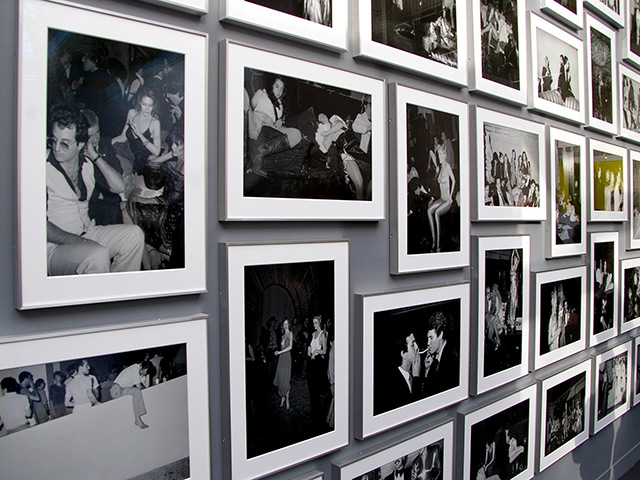
Assemble a collection for your gallery wall
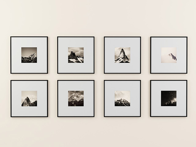
Framing is a great way to enjoy a collection of images. If the images are linked items, a series, or visually similar, consistency is the key to making your gallery wall feel like a collection. The images in our example are the same coloring, so it is easy to frame them all with the same matting and moulding. Consistent design emphasizes that the grouping belongs together and brings focus to the art.
Unite your art
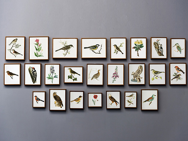
Your gallery wall should be united in some manner. It can be by image style, image subject, size, frame moulding, or by mat color. In the design world, this is known as the theory of gestalt — the idea that humans have an unconscious tendency to group things together visually, whether intended or not. So apply this theory to your gallery wall and figure out what connects them. Why are you combining these particular images? Use the design to reinforce your reason.
Use a mix of frame styles (ornate, traditional, modern), but make all the frames the same color. This can be easily accomplished by simply spray painting a bunch of random frames the same color — boom, they look alike. Use a completely different frame style for each image, but all the images are the same subject. Or, the images could all be black and white, or landscapes. Use the same size image, matting color and frame. For example, random images that are all in square black frames will look like a cohesive group.
Fill an odd sized space with a gallery wall
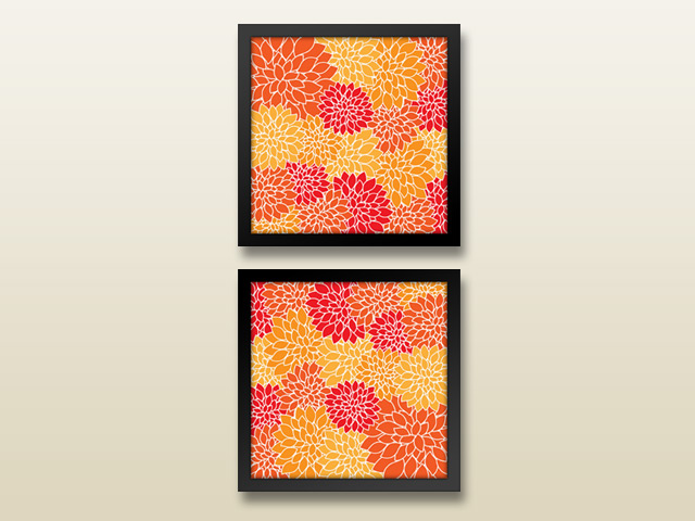
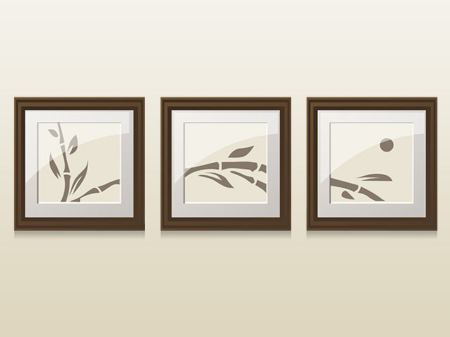
An extremely long or tall wall can be intimidating to fill. For a wide horizontal space, consider multiple pieces hung side by side. Buy a panoramic print, cut it into three pieces, and frame each piece individually but in the same style. For a tall vertical space, consider stacking multiple pieces in a column. Buy three of the same print and rotate each so that the grouping looks like one piece. Because wall groupings are so flexible in their layout, it’s easy to customize for an odd sized space. You can even create a gallery wall to fill an odd space that goes around a corner.
Choosing the layout for your gallery wall
A symmetrical layout for a gallery wall is even and organized, creating a formal, structured arrangement. They tend to be grid-based, with equal sizes and consistent framing styles. Images may either line up horizontally, vertically or both based on the number of pieces, shape of individual pieces and overall size. Treat a grouping of pictures as a single unit.
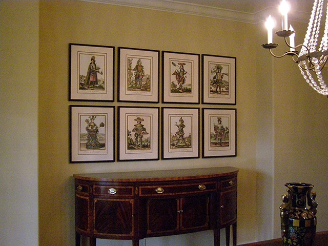
An asymmetrical layout is more casual, using different sizes, styles, and colors to create a eclectic visual collage. It takes a little more planning to ensure that this kind of grouping does not feel chaotic or random, but the overall effect can be very creative. This is a time when ‘different’ works together.
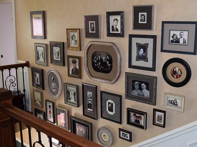
When creating the grouping layout for the wall, there needs to be a sense of balance. A general rule is to begin in the center and work outward, making sure that the larger pieces always have a counter balance. It’s ok to mix vertical and horizontal pieces. For symmetrical layouts, measure your available space to make sure your pieces are properly centered. If you have an uneven space to fill (like by a staircase), keep the heaviest piece to the bottom as your eye naturally goes from bottom left to top right. If your asymmetrical arrangement is in a normal sized space, the heaviest piece should be placed in the center.
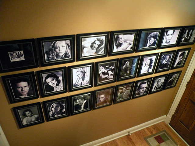
When deciding placement on the wall, be creative. These black & white glossy pictures of movie stars in a home theatre are framed and arranged so that the overall unit resembles a film strip.
Hanging your gallery wall
Plan. It. Out. Having a set plan of how the grouping will hang will save you a wall full of nail holes! The ideal situation is to choose which pieces you want to have framed for this area, and get them all designed at the same time, so that you will have a cohesive look.
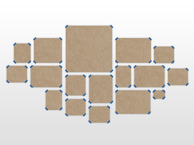
Spacing between each piece should be proportional to the overall size you have available. If pieces are placed too close it will make the art look crowded; too far apart will make it feel disconnected. Varying spacing can seem chaotic and random. Generally, 2” to 3” apart is a good distance between each piece. Correct spacing sometimes depends on the amount of room you can devote to the grouping.
After the images are framed, make a template of each piece to be hung. Trace around the outside of the frame on kraft paper, cut out the shape, and label it. Note on the paper whether the art is vertical or horizontal. You may also want to note which picture it is. Secure the templates to the wall with painter’s tape. Stand back and look at the arrangement. Do you like it? Or do you need to rearrange? Once you have decided on a plan, leave them up there until the pieces are actually hung.
Additional Topics
Museum Glass
When you have multiple items hanging together, that’s a lot of glass. The more surface space, the more chance for reflection. Eliminate glare by using Museum Glass. Museum Glass has exceptional clarity, so that you can really SEE what is behind your frame!
Delivery & Installation
Lots of framed pieces? We would love to deliver & hang your new collection for you. Ask us for details on how we can help you arrange your frame grouping.
